|
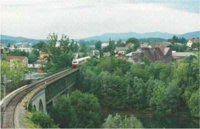
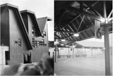
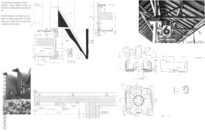
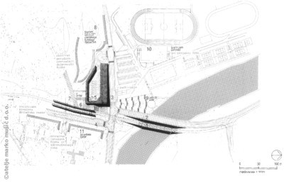
Znakovno oblikovanje pročelne stavbe z inicialkama NM ji daje potrebno identiteto in tudi v širši prostor vnaša prometno oznako kraja in nove postaje. Njena značilnost je daleč pred današnjimi trendi realizirana z naravnim lesom obložena fasada. Zaradi še vedno nedograjene poslovne stavbe ob prometni ploščadi (2. faza) ostaja (pročelni paviljon) torzo, obenem pa je razvrednotena druga stran vstopa v mesto, čeprav je za njeno ureditev arhitekt zmagal na natečaju. The need for a pure identity for a new public building is realized with a magnified number plate abbreviation for Novo Mesto. Both letters - N and M – determine the most exposed side of the bus station also in a broader area. One of the characteristics is the implementation of natural wood coating (a pioneer, far before actual trends realized particularity). Because of still unrealized business building next to the traffic platform (2nd phase) the main building remains a torso. Adittionally stricken and affected by the willfully devalorised other side of the city’s entrance though the architect won a competition for its arrangement. Več v monografiji Znak v prostoru (ISBN 86-7207-065-8) / more in monograph A sign in the space (ISBN 86-7207-065-8). [ ǀ ] |